

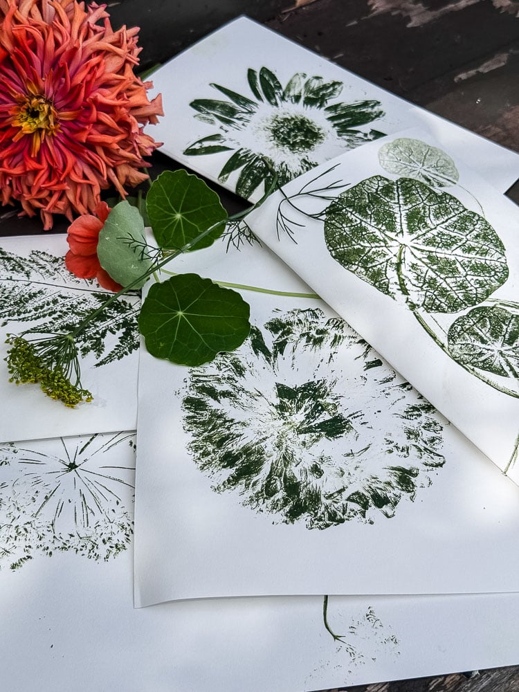
How to Make Nature Prints from Garden Flowers, Leaves & Herbs (No Artistic Ability Required)
I have a confession. When I walked outside with an ink pad and my garden snips, I genuinely wasn’t sure what I was going to end up with. Nature printing, the technique of inking up a flower or leaf and pressing it directly onto paper, sounded promising, but I’d been burned by enough “it’s so simple!” craft tutorials to keep my expectations in check. I shouldn’t have worried.
What I ended up with looked like a collection of vintage botanical prints, the kind you’d find in a fancy home goods store with a $40 price tag and zero explanation of where they came from. Except I knew exactly where they came from. My garden. My nasturtium leaves, my rose of Sharon, my herbs, my zinnia. And that made them about a thousand times better. I liked the herb prints so much, a series in midnight blue ink, that I pulled the art out of three small frames near my entryway table and replaced it with my own.
This is one of those projects that fits perfectly into what I think of as my garden-to-home philosophy: the idea that what you grow outside should find its way inside in the most beautiful way possible. Nature printing is an easy way to do that. You don’t need any artistic ability; the supplies aren’t terribly expensive, and you don’t need a long list of supplies, and the results are genuinely stunning.
Let me show you exactly how it’s done.

Welcome! I’m Jennifer, and I’ve always believed nature is the most beautiful art supply. For years, I’ve been preserving New England’s blooms and foliage through pressing, drying, and crafting. Let me show you how to capture a little bit of the season and bring it indoors—simply and beautifully.
This post may contain affiliate links, which means we receive a small commission if you purchase through our links. See our disclaimer page for more information.
What You’ll Need
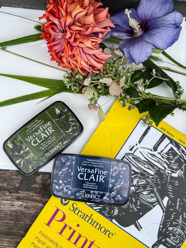
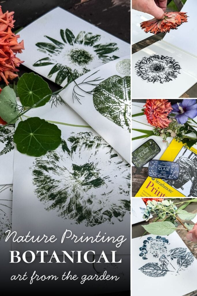
Materials for this Project
The Ink
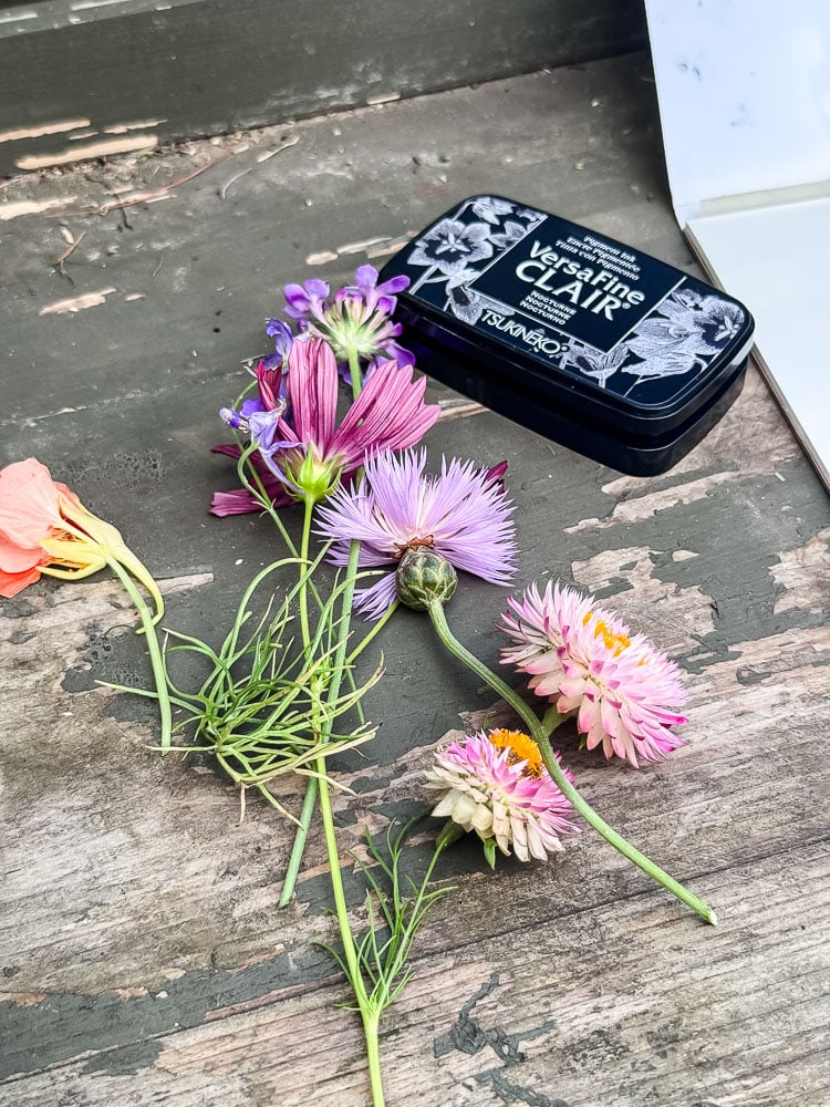
- Archival ink pads (I already had VersaFine, available from scrapbooking retailers; Ranger brand is widely available on Amazon and works beautifully. Just make sure whatever you choose is labeled archival, acid-free, and waterproof)
The Paper
- Printmaking paper or a lighter-weight watercolor paper. You want something with just enough texture to capture the detail of the botanical
- A few sheets of scrap paper
The Botanicals
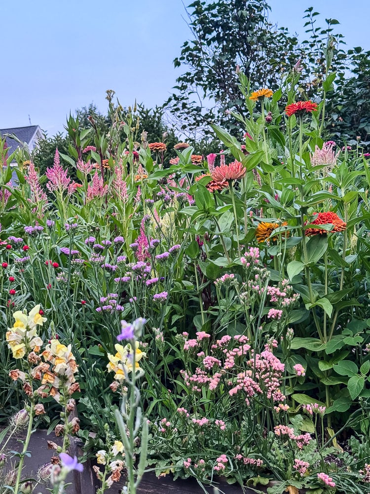
- Fresh flowers, leaves, and herbs from the garden or a market bouquet if you don’t have a cutting garden.
- Garden snips or scissors
A Note on Ink Pads: This is the one place in this project where it really matters what you buy. Archival ink is acid-free, waterproof, and permanent; that’s what gives you crisp, detailed prints that hold up over time without fading or bleeding. Skip this step and grab whatever’s in your craft drawer, and you’ll end up with muddy, faded results.


What to Print & What to Skip
This is the part most nature printing tutorials gloss over, and it’s actually really helpful to know before you head out to the garden with your snips. Not every flower prints equally well, and a little knowledge upfront will save you some frustration.
The Best Performers:
- Nasturtium leaves hands down one of my favorites. The vein detail that transfers is absolutely incredible, almost architectural. If you grow nasturtiums, start here.
- Rose of Sharon / hardy hibiscus: my personal favorite print of everything I tried. The petal detail is stunning.
- Herbs: oregano, rosemary, borage, & thyme all printed beautifully, especially in midnight blue ink. The delicate stems and leaf clusters create the most elegant results.
- Ferns: a classic for a reason. That feathery frond shape translates perfectly onto paper.
- Sunflowers: I tried a smaller sunflower in green ink, and it came out great. The petal definition is really lovely. That being said I don’t think larger ones would really print well.
- Scabiosa, sweet sultan, and daisy-type flowers: beautiful, especially when arranged in a loose bouquet composition on a full page.
- Hydrangea: the clusters of small blooms create a really interesting textured print.
What Didn’t Work:
- Strawflowers: I tried, and the papery petals don’t have enough surface texture or moisture to transfer ink well. Skip these and use them for drying instead.
- Cosmos: My petals came off when I was patting the ink on. I tried a couple of different times with the same results and didn’t want to waste any more of the ones I could use in my flower press!
A general rule of thumb:
Flowers and leaves with interesting surface texture, visible veining, or defined edges tend to print the best. Very thick, chunky, or highly three-dimensional flowers are harder to get full contact with the paper, which means a patchy result.
One important practical note:
If you’re planning to print a lot of botanicals in one session, either keep a jar of water nearby and pop your clippings in as you go, or clip just one or two things at a time and come back for more. I was working outside at my potting bench on a warm day and had to toss a few blooms and ferns before I even got to them.
Fresh flowers wilt faster than you’d think once they’re cut, and a wilted flower won’t lie flat against the paper the way you need it to. Fresh is everything with this technique.
Choosing Your Ink Color
One of the things I love most about this project is how completely different the results look depending on which ink color you choose. I experimented with three colors while I was making my prints, and each one has its own look.
Green feels the most natural and garden-fresh
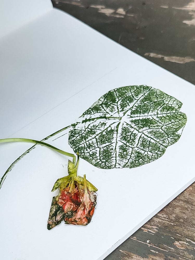
Like the botanicals printed themselves. It’s a beautiful choice for leaves and herbs especially, where the green ink feels like a natural extension of the plant itself. My small sunflower print in green is one of my favorites.
Midnight blue is where things get really elegant.
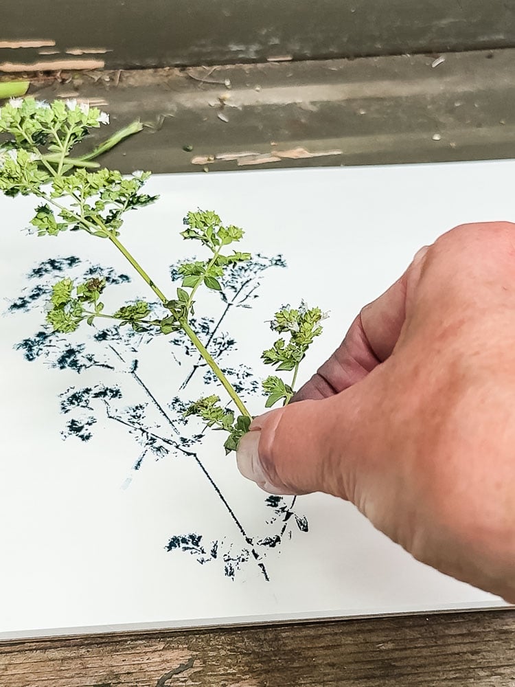
There’s something about that deep, slightly moody blue that makes even a simple herb sprig look like a museum-worthy botanical illustration. This is the color I used for my entryway herb series, and honestly it’s the one I keep coming back to. If you only buy one ink color, this might be the one.
Black is the most dramatic of the three.
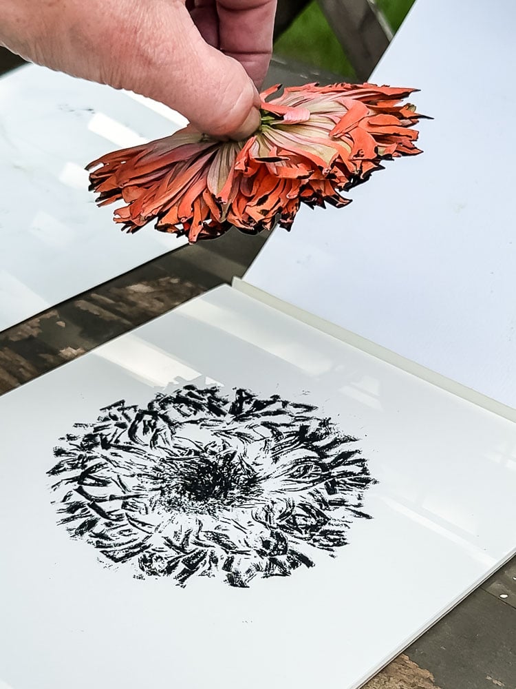
Graphic, bold, almost like a woodblock print in quality. The giant zinnia I printed in black looks like something you’d find in a fine art print shop. It’s a completely different vibe from the green and blue but equally as pretty.
The good news is that archival ink pads come in a huge range of colors beyond these three! Dusty rose, burgundy, forest green, navy, terracotta. The color you choose can completely change the mood of the finished print, so don’t be afraid to experiment. A set of prints in two or three coordinating colors also makes for a really beautiful gallery wall grouping.
How To Do It
The process sounds almost too simple when you write it out, but there are a few key moments where the details really matter, so read through the whole thing before you start.
Step 1: Set Up Your Workspace
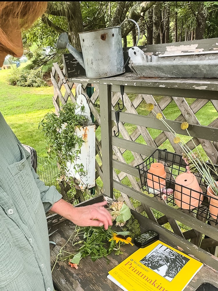
Lay out your printing paper on a flat surface. Have some scrap paper nearby. You will need one to work on when you’re inking your botanical, and one to cover it during pressing. I switched up my scrap paper when I changed ink colors too.
Have your ink pad ready and your garden snips close by. If you’re working outside like I was, keep a jar of water handy for any flowers you’ve clipped but aren’t ready to print yet.
Step 2: Ink Your Botanical
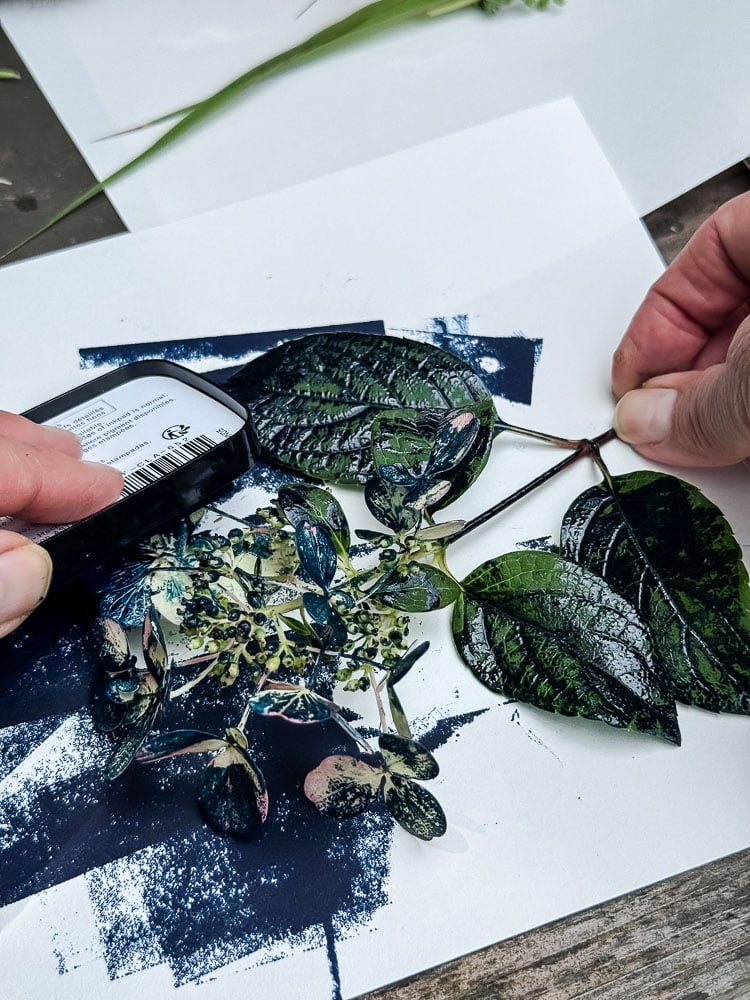
Place your flower or leaf face-up on your first sheet of scrap paper. The side you want to capture on your print should be facing up.
Open your ink pad and pat it directly onto the surface of the botanical, making sure to cover every part of it, including the edges, and don’t forget the stem. You want an even, thorough coat of ink, not so heavy that it fills in all the detail, but enough that the whole surface is covered.
Step 3: Transfer to Your Printing Paper
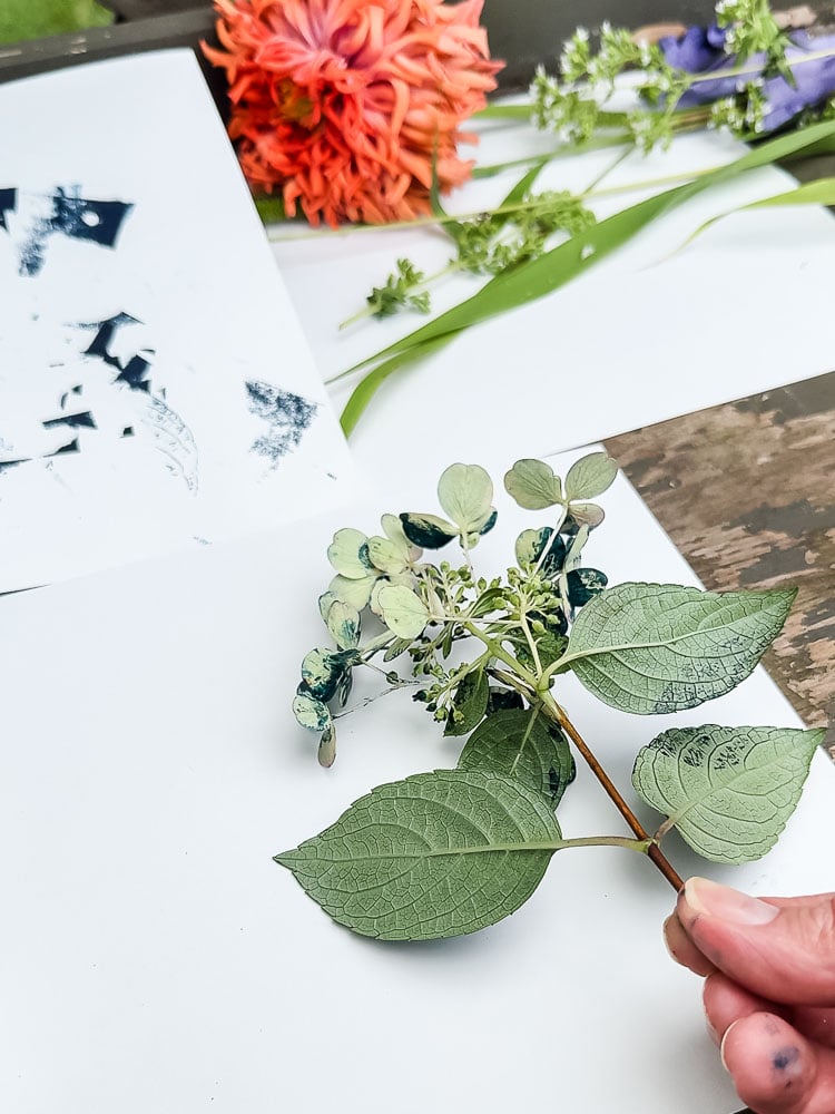
This is the step where you need to slow down and be deliberate. Pick up your inked botanical carefully and place it ink-side down onto your printing paper, arranging it exactly where you want it.
Here’s the most important thing to know: you really only have one chance to place it. The moment it touches the paper, it will leave ink behind, so if you move it or second-guess your placement, you’ll end up with a smudge on the paper. Take a breath, commit to your placement, and set it down.
Step 4: Press
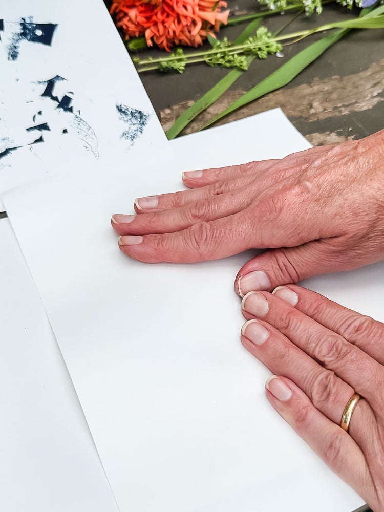
Place your second sheet of scrap paper over the top of the botanical to cover it. Then use the flat of your palm, not your fingertips, to press and swipe firmly across the entire surface. Work methodically so you hit every part of the flower and stem, using your other hand to hold the paper taut and keep everything from shifting.
You’ll feel the botanical underneath and can make sure you’ve covered every edge and petal.
Step 5: Reveal
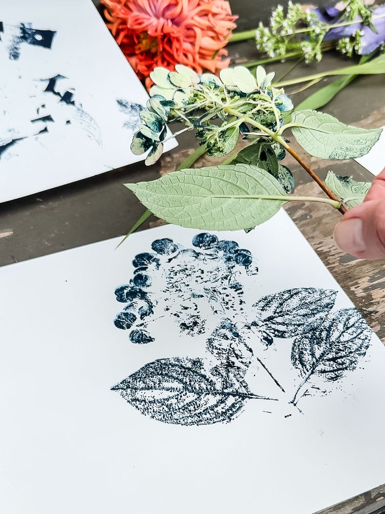
Carefully lift the scrap paper, then peel back your botanical slowly from one edge (using the stem, if there was one, was the easiest way). What’s left should be a pretty cool image of whatever botanical you used.
Let it dry completely before touching or stacking. Archival ink dries quickly, but give it a few minutes to be safe.
If it’s not quite perfect, don’t be too quick to toss it. Some of the most interesting prints have a little imperfection to them: a lighter edge here, a ghost of a second impression there. That’s part of what makes them look handmade rather than printed by a machine.
Tips for the Best Results
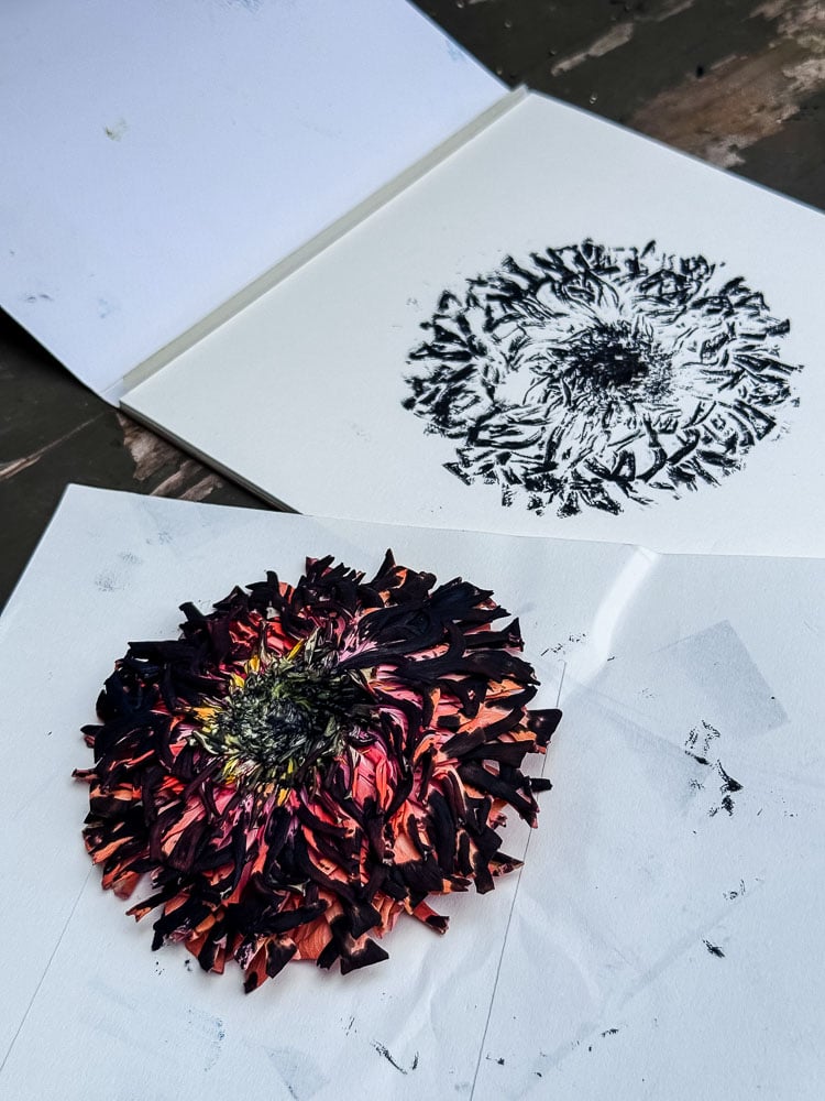
Work quickly once inked. Once the ink is on the botanical, you should move right to the paper. Have your printing paper ready, and think about what you want to create. Do you want the flower smack dab in the center, or are you adding other elements to the sheet? When I was doing my hydrangea stem, I held the inked flower over the paper and centered it before placing it gently down.
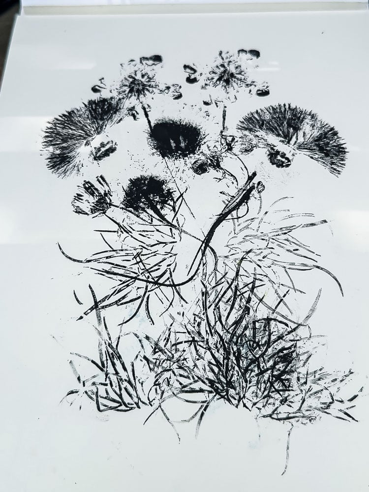
The bouquet approach is worth trying. I created mine one flower or leaf at a time. It takes a little more confidence, but the result looks like a piece of real botanical art. The key is to think about it like you’re arranging an actual bouquet: a focal flower, some supporting blooms, and plenty of stems and foliage to fill it in. This was the last print I did after I had a little practice under my belt.
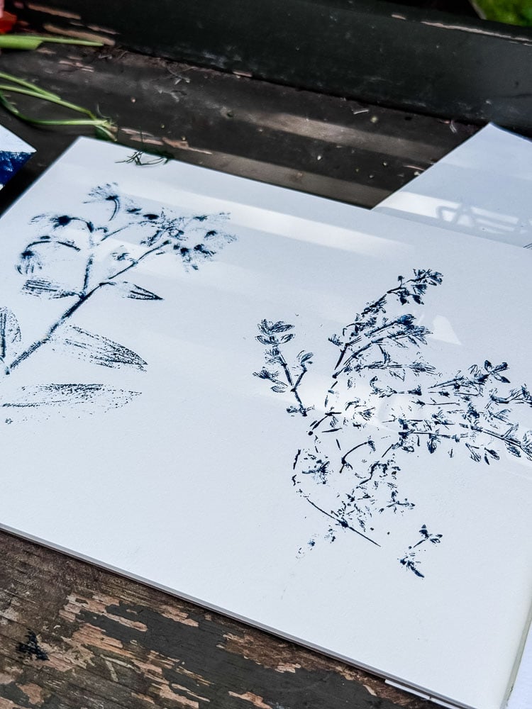
Smudges and smears are not the end of the world. Here’s a trick I discovered by accident: if you get a fingerprint or an ink smear on your paper, just print another flower or leaf right over it, and suddenly it’s a grouping! Some of my favorite prints started as a mistake I was trying to cover up. Don’t be too worried about it; just lean into the imperfection and keep going!
Imperfect prints have their own charm. A slightly lighter fern, a petal that didn’t quite transfer completely. These are the things that make a nature print look handmade rather than mass-produced. If you find yourself chasing perfection, you’ll throw away prints that are actually beautiful. Step back and look at the whole thing before you decide it’s a failure.
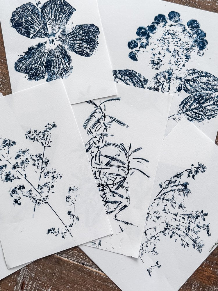
Frame in sets. A single nature print is pretty. Three of the same flower in the same ink color, framed identically and hung in a row, is stunning. My herb series near my entryway is proof. I used oregano, rosemary, and thyme in midnight blue ink. I already had the frames, so I just switched out the art.
How to Display and Use Your Prints
Framed Art:
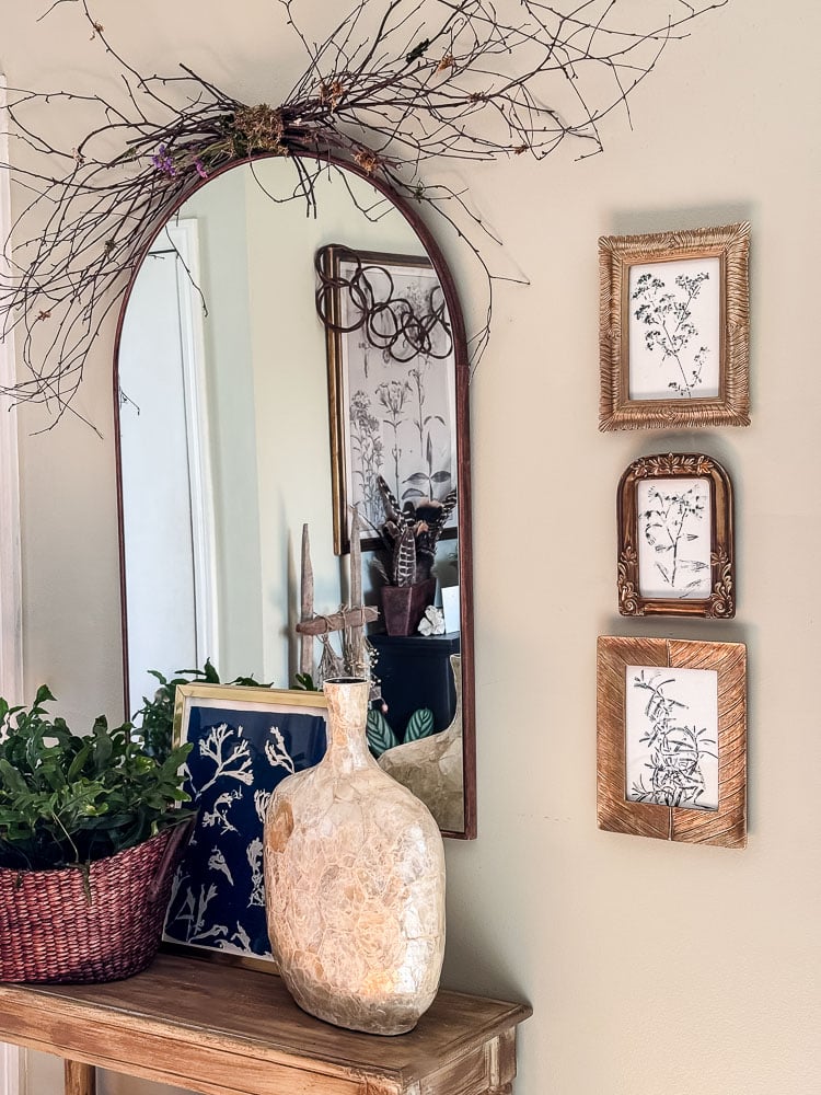
This is my favorite way to use nature prints and honestly the one that will make people stop and ask where you bought them. The key to making framed nature prints look intentional rather than crafty is to think in series. Pick one ink color, one type of botanical, and print several of the same thing. That repetition is what takes it from “a fun afternoon project” to “a cohesive piece of wall art.”
My herb series is the perfect example. Oregano, rosemary, and thyme, all printed in midnight blue ink, all in small gold frames lined up near my entryway table. I simply swapped out the art prints that were in the frames; no new frames required! Total cost of the project: one ink pad and an afternoon in the garden.
For a gallery wall, try mixing ink colors within the same botanical family. I think a few ferns done in different ink colors would look so cool! Or mix botanicals but keep the ink color consistent throughout.
Notecards
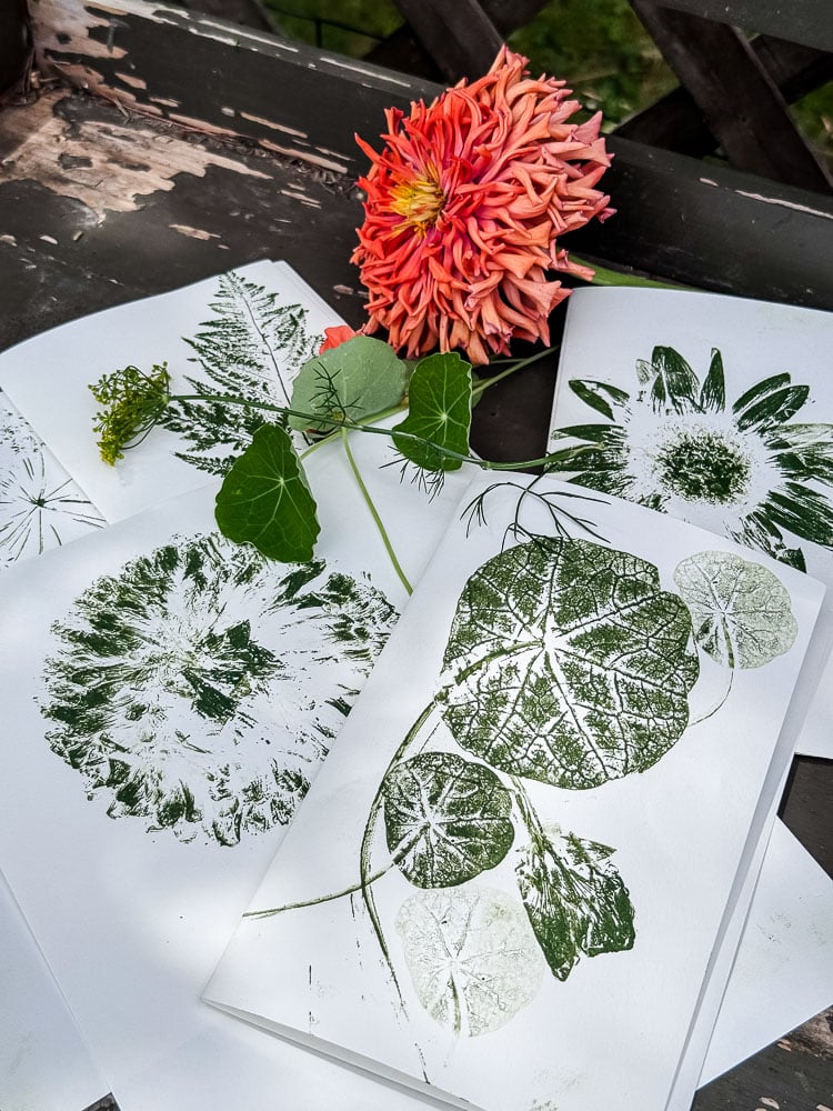
I think nature prints would be such beautiful notecards. A single small flower or herb sprig centered on a white card would look so elegant and thoughtful. I didn’t make a set this time around, but it’s absolutely on my list. A set of handmade botanical notecards tied with a ribbon would also make a stunning hostess gift, especially paired with a little something from the garden.
Gifting
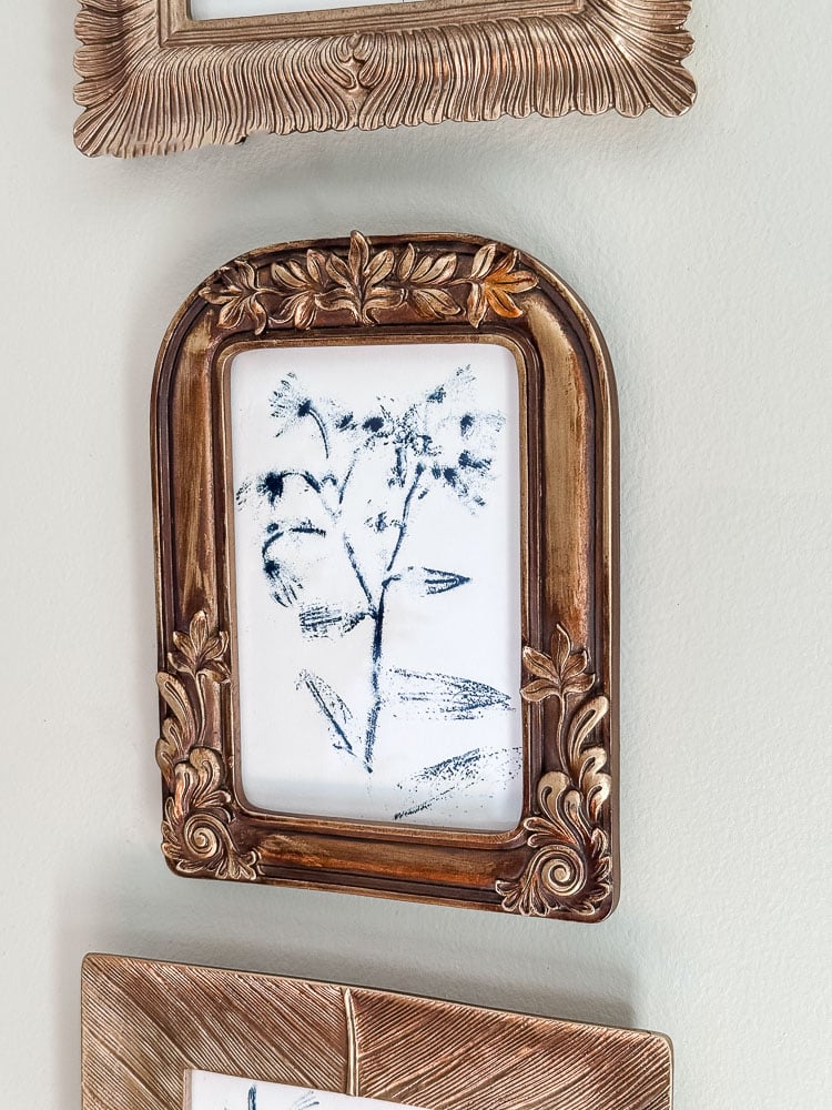
Speaking of gifts, a set of framed nature prints is one of the most thoughtful handmade gifts you can give, and it costs almost nothing to make. Print a series of someone’s favorite flower, pop them in a few simple frames, and you have a gift that looks like it came from a boutique. No one needs to know it came from your potting bench on a Tuesday afternoon!
Your Garden Deserves to Be on Your Walls
This is the project I didn’t know I needed until I tried it, and now I can’t stop thinking about what to print next! There’s something genuinely magical about taking a flower you grew yourself, pressing it onto a piece of paper, and ending up with something that looks like it belongs in a natural history museum. Or a fancy boutique. Or your entryway, which is exactly where a few of mine ended up today. That’s the whole point of the garden-to-home philosophy, isn’t it? The garden isn’t just something I tend and admire while I’m outside. It’s truly a creative resource for me, and I try to find as many ways to bring it inside my home too.
Nature printing is one of the simplest, most satisfying ways I’ve found to close that loop. So grab an ink pad, head outside, and see what your garden has to say. I have a feeling you’ll be rearranging your frames by the end of the afternoon.
If you make a set of prints, I would love to see them!
See your projects featured! If you are inspired by this or any of my other DIY projects, I would love to see them and add you to the Reader’s Spotlight gallery. Send a photo to me at jennifer@cottageonbunkerhill.com
xo, Jennifer




Jennifer, this is similar to one of my favorite art projects when I was teaching preschool! We used paint, but it was the same idea. They do turn out beautiful! The parents liked them. Great memories…
Jennifer, Loved your inked botanicals! I would like to try white ink on navy paper. I used to do the same with leaves and acrylic paint on fabric. Going out to the garden now to try your ideas